Old Logo
Logo Refresh
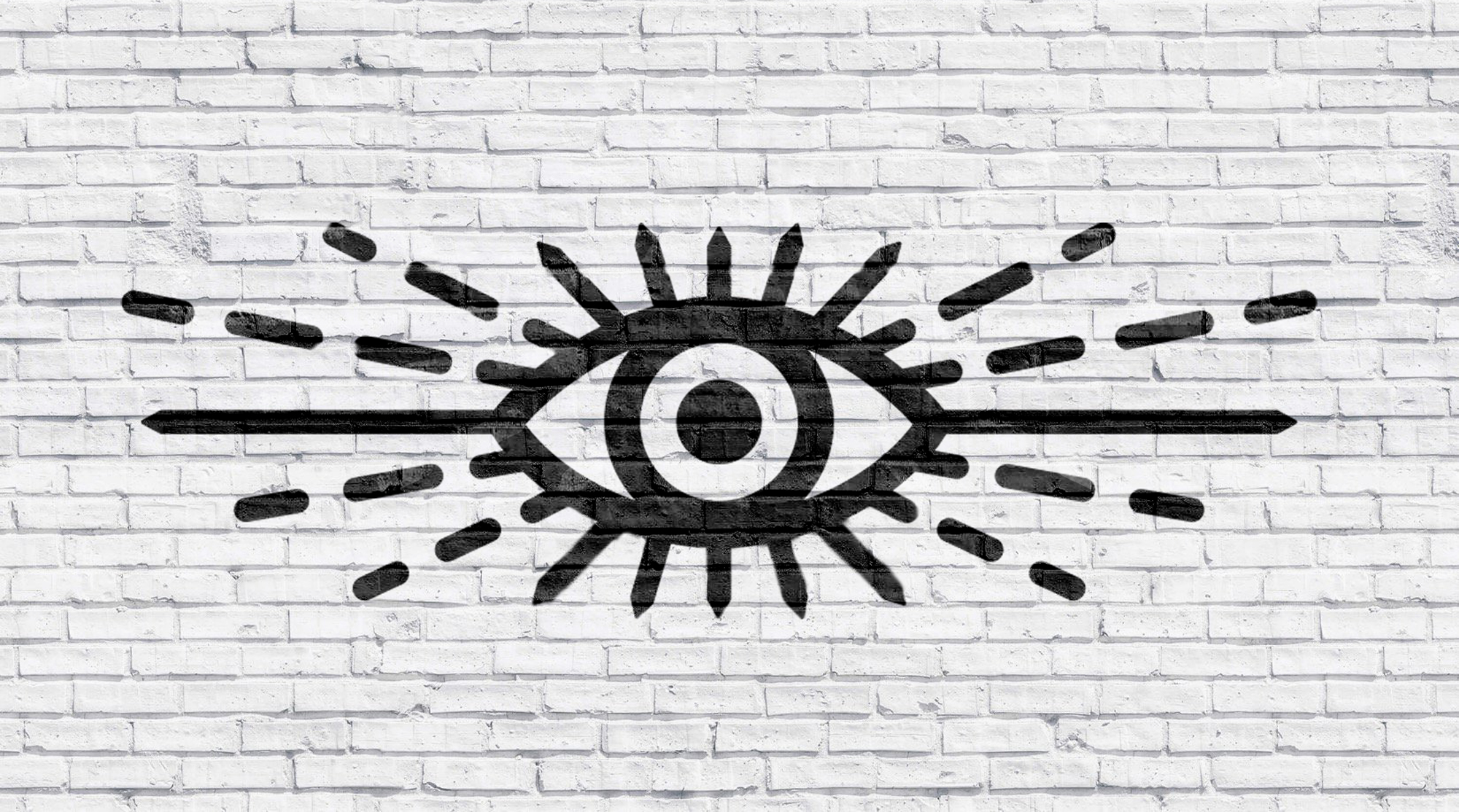
The first thing I wanted to tackle was a logo refresh.
The current logo had some hierarchy problems as well as some general design issues that were causing problems in print, web and store signage.
I also wanted this mark to become an icon of the brand so it had to have a little more standalone presence.

Main Logo Edits
1. Moved the eye to the top for better hierarchy
2. Revamped the "Revelator" typeface
3. Added Points to the eye lashes (taken from the type) to create a more iconic mark with more contrast
4. Created equal spacing all around for print and signage applications
5. Rounded "Coffee Company" to match the burst from the eye
New Logo
New Packaging
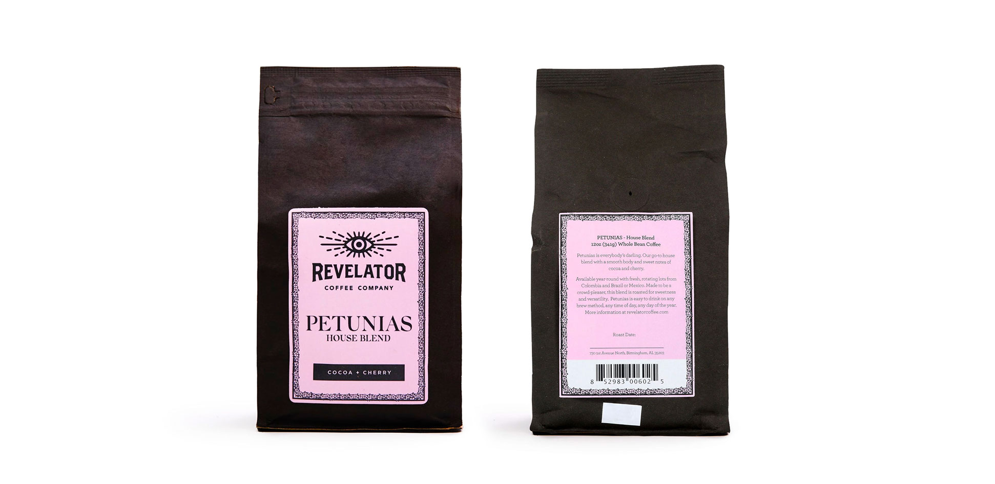
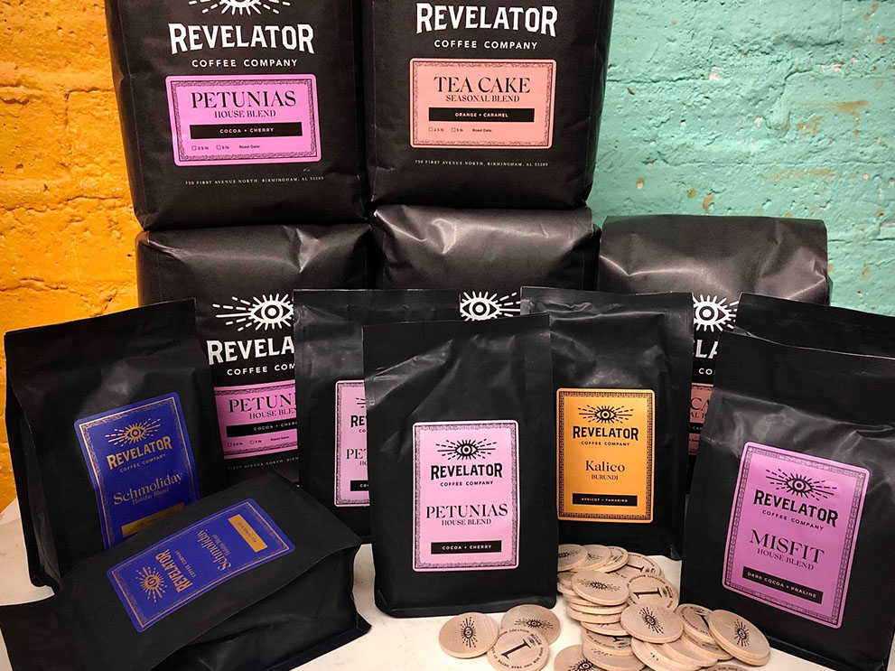
Packaging
At Revelator Coffee Company, there were always 10-15 coffee options available. 3 Core blends,
1 seasonal, 1 wholesale blend and 6-10 single origin coffees. Each of the different groupings needed to have a separate design feel all while being cohesive as a set. We didn't want do design on the actual bags so we could use one for all the options and keep the bags as Eco-friendly as possible. What we came up with was a border design that was less than a quarter inch in size.
The first set below are the core blends that were always in rotation.
Petunias - Dedicated to one of the women founders
Misfit - Based southern religion in "A Good Man Is Hard to Find"
Pale Rider (Decaf) - Based on Katherine Anne Porter novel


*This coffee sold to wholesale only, hence the name 9 to 5. Pattern and coffee naming was inspired from Dolly Partons' sequin details on one of here iconic her dresses

Packaging Pattern
Single origin coffees needed 6-12 subtle unique designs.
I created a pattern using a 16 square pattern that could be used on
the 6-12 blends that were in stock. Here are some of them.


Packaging Lineup Intention
As a set of products the coffees created a "rainbow effect" to brighten up our Revelator stores, distinguish different products and hint at the brands commitment to being an inclusive brand. Core blend products were in shades of purple and pink with the single origin products were, well, the rest of the colors.
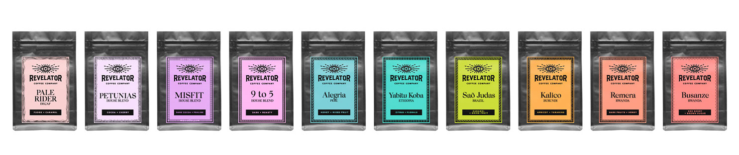
Official bag line up order and web icons at small scale

NOTE* Ideally I wanted the logo printed separate from the label on bags but due to the switch to a more eco friendly bag we could no longer print on the bag.
Example of the two styles below:
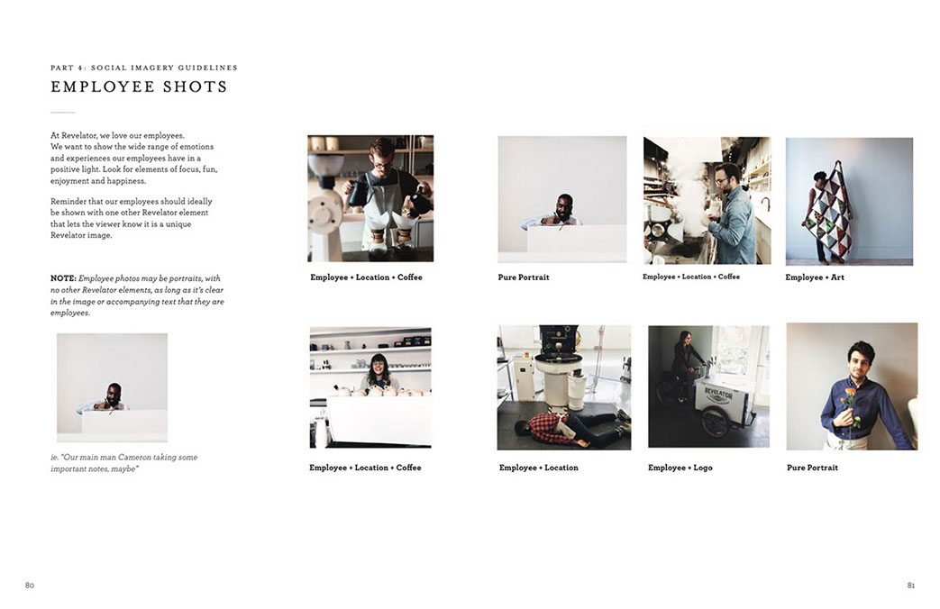
Social Direction
I was responsible for maintaining the look and feel of the brand's social post. Our stores were filled with talented photo taking baristas who assisted in creating content, but it still needed direction. Here is some of it.
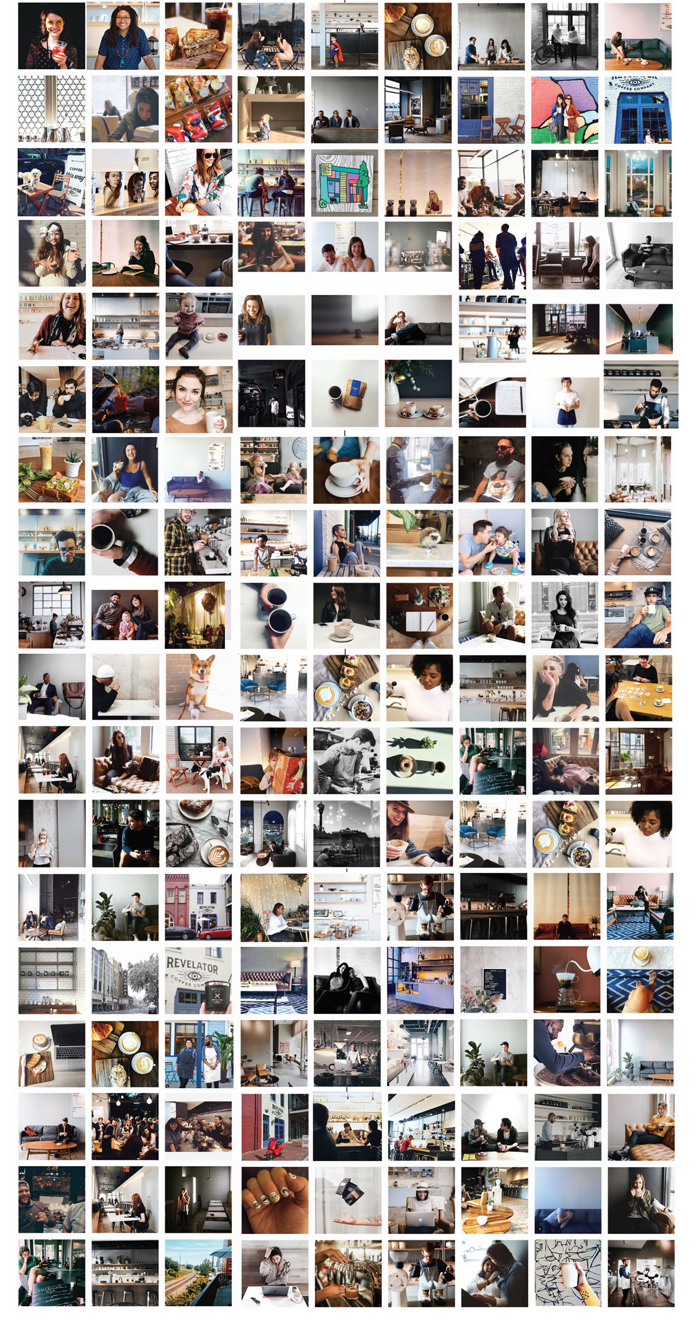
Illustration Style
The brands illustration and icon style was created to add a human touch to the brand and create contrast with the beautiful, minimal feel of our locations. It also allowed our staff filled with artist the ability to create elements on the fly for events and their stores dedicated social.
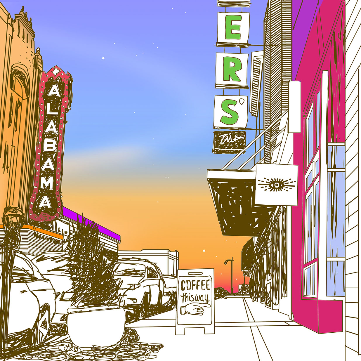


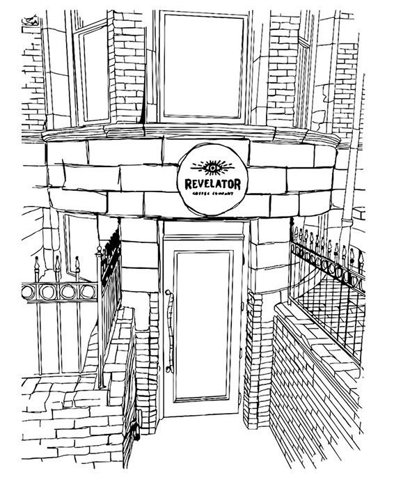


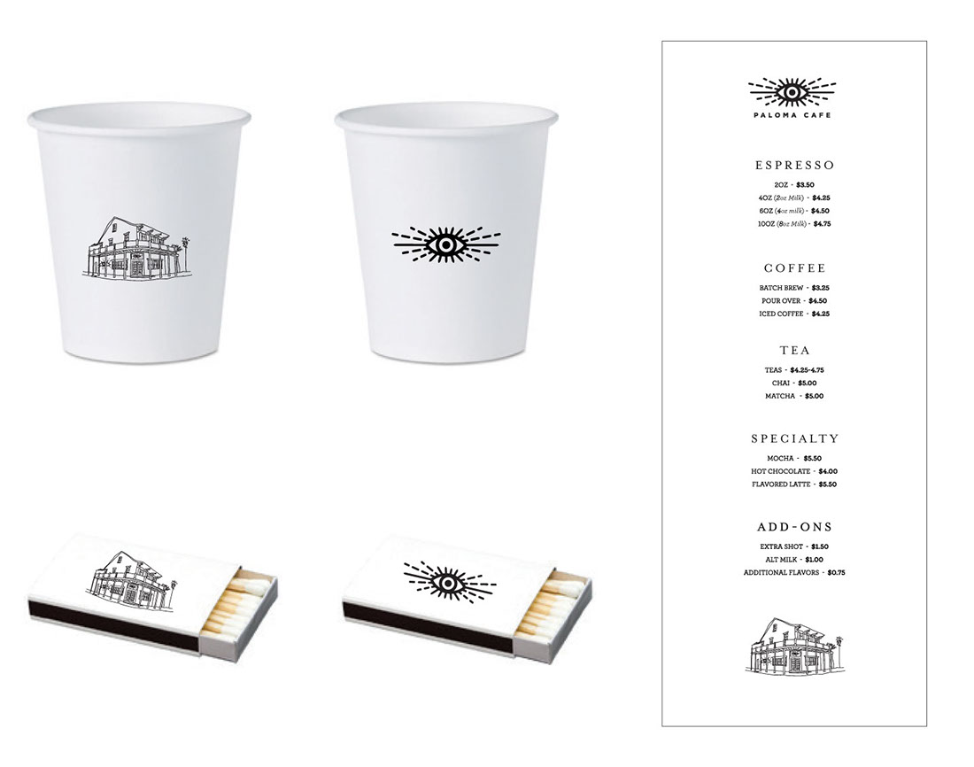
Location Specific Illustrations
Each location had their own dedicated illustrations and icon set to be used for collateral.
These illustrations as well as the eye were turned into stamps so stores could make collateral as needed if not a printed piece.
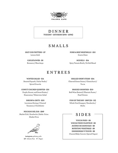
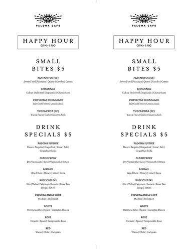
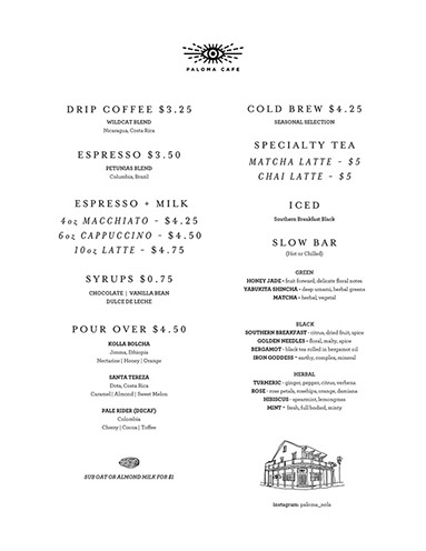
Here is the set for our "Paloma" location in New Orleans.


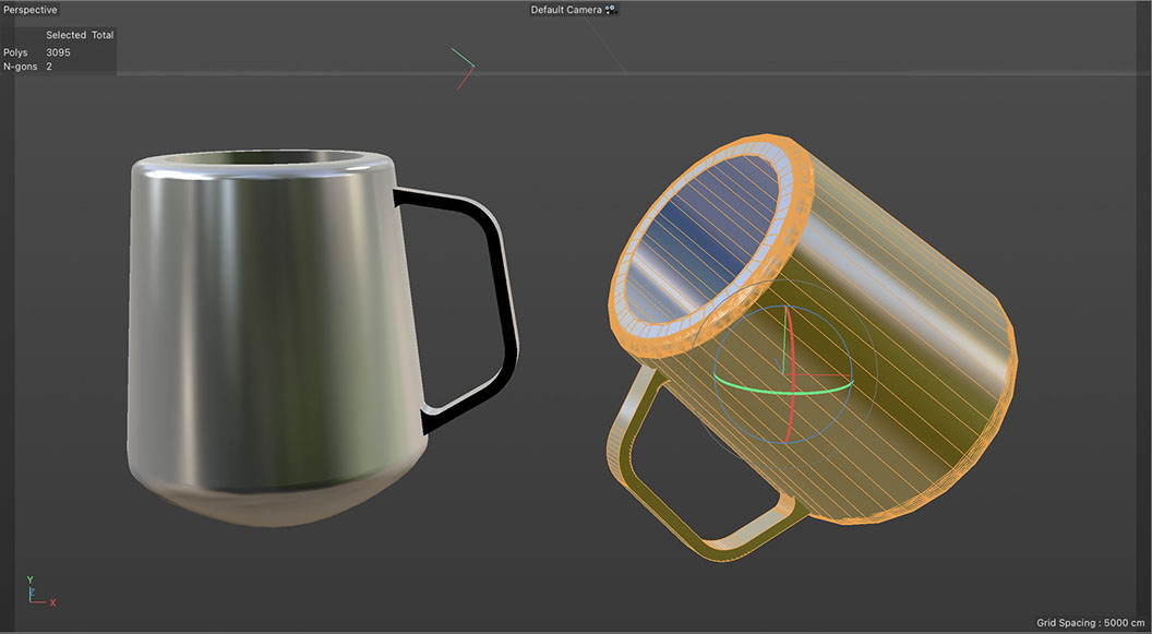
New Mug Design
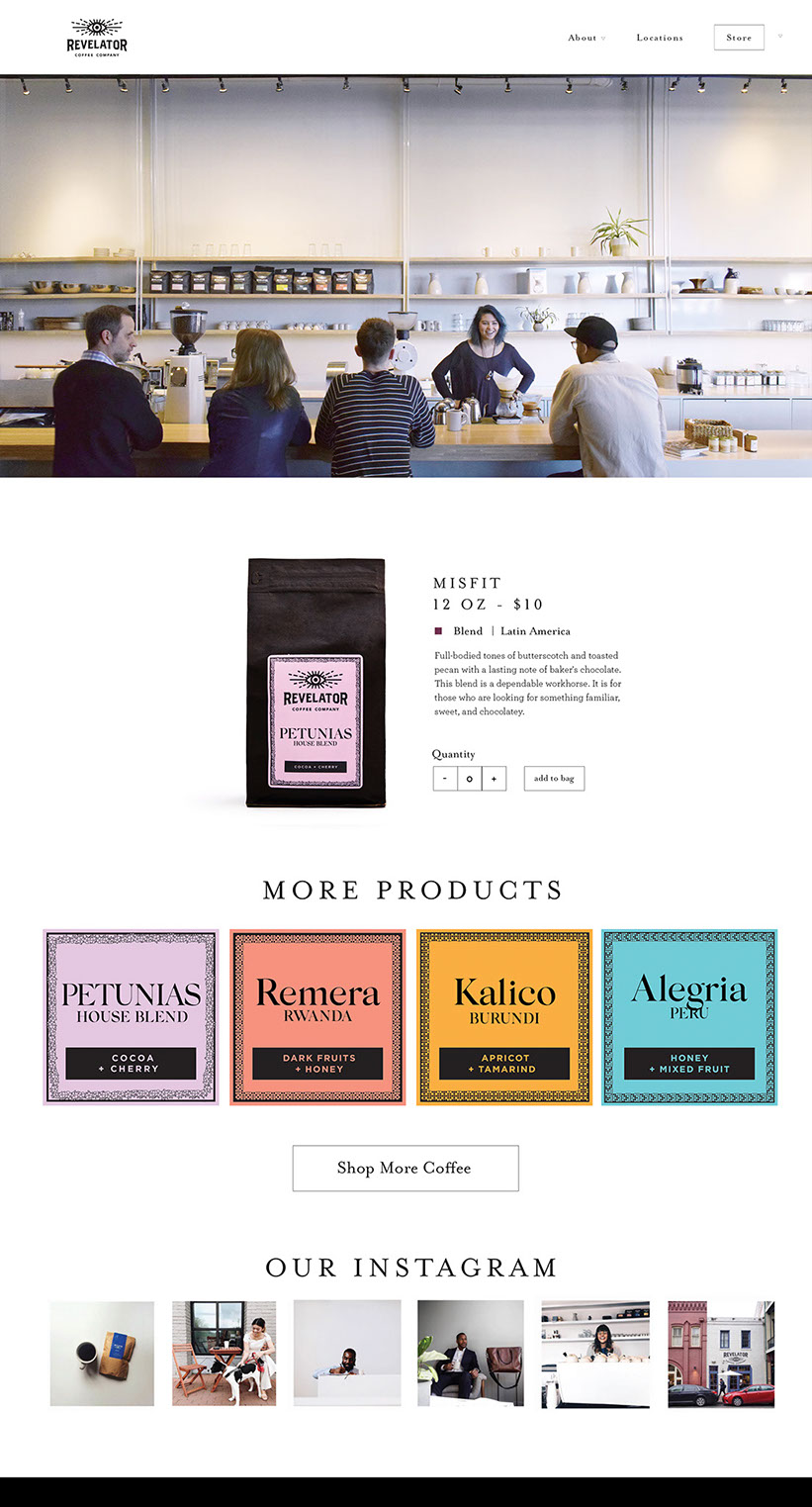
New Website
Brand Standards & Employee Training
Check out these two documents below to get a deeper understanding of the standards I created while at Revelator.